Van Briggle Glaze Reference Guide
Early Van Briggle glazes are more dynamic and more sought after by collectors than anything produced in later decades. The earliest pieces often combined multiple glaze colors on a single form, creating dramatic firing effects that varied from piece to piece. No two early vases look exactly alike, and that unpredictability is a large part of what makes them so desirable.
This guide covers the major glaze families and their evolution from the pottery's founding in 1901 through modern production. Within each family, you will find a timeline showing how the glaze changed across decades — information that is essential for accurate dating and identification.
Glaze identification works best alongside bottom markings and clay analysis. A glaze that looks like Mulberry but sits on post-1946 clay with modern markings is almost certainly Persian Rose. Always cross-reference with the markings guide and clay body history. For the chemistry behind why matte, gloss, and crystalline glazes behave the way they do, Daniel Rhodes’ Clay and Glazes for the Potter is the standard reference. For a parallel glaze-by-glaze tour of the other major American art pottery, Rookwood Pottery: The Glaze Lines by Anita Ellis is the equivalent of this page for Rookwood.
Contents
1. Early Glazes (Pre-1920)
The foundational palette
The earliest Van Briggle glazes are the most varied and the most prized. Artus Van Briggle and the potters who followed him in the first two decades experimented constantly, layering glazes and adjusting formulas. The results were often stunning and always unique.

1903 Green
A classic light green glaze with light overspray on top. This is one of the earliest recognizable Van Briggle glaze treatments and remains a benchmark for collectors evaluating early pieces.

1904 Blue on Blue
Two distinct glazes applied to the same piece. The upper glaze may derive from what would later become known as Ming Blue. The layering effect produces a depth of color that single-glaze applications cannot achieve.

1907 Gold-Brown
Possibly a single glaze that appears lighter or darker in different areas due to pigment settling during firing. The variation gives the surface a warm, organic quality that shifts as you turn the piece in your hands.

1907 Green
A classic early Van Briggle green formulation. Distinct from the 1903 Green, this version reflects the continuing evolution of the pottery's glaze chemistry in the years after Artus's death.

1915 Plum
Familiar to collectors and sometimes classified as a Mulberry that has shifted toward purple. The distinction between Plum and Mulberry can be subtle, and pieces from this era sometimes sit right on the boundary between the two.

Mountain Crag Brown
A brown body under the light green overspray that characterizes many early Van Briggle pieces, well regarded for its naturalistic palette. Our archive examples of this treatment are labelled to the teens, though the name and the documented production run belong to the 1920s.
Often seen spelled “Mt. Craig.” Full history, the correct name, and the dating question are covered under Browns & Earth Tones.
Glaze reference photos courtesy clemhull.com
2. Ming Blue
The signature Van Briggle glaze — a century of evolution
Ming Blue is the glaze most people associate with Van Briggle pottery. It has been in production longer than any other glaze, and its appearance has changed significantly over the decades. Understanding those changes is one of the most reliable ways to date a piece.

1906
Turquoise glaze, likely a Ming Blue variant. This is among the earliest appearances of the blue family that would define Van Briggle for the next century.
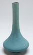
1914 (Teens Ming Blue)
The teens-era Ming Blue with typical early imperfections. These irregularities — small variations in color depth, occasional pinholes, uneven coverage — are part of what makes early pieces desirable. They are signs of handwork, not defects.
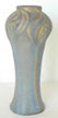
Late Teens
Nearly translucent, with small darker blue and mulberry highlights visible in the glaze surface. This era of Ming Blue has a luminous quality that later formulations would not replicate.
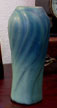
Teens / 1920s
The "Dirty Bottom" style, characterized by dark blue overspray. The term refers to the unfinished, darker appearance at the base of the piece where overspray accumulated during glazing.

1920s
Two distinct variants emerge during this decade. After 1926, a lighter version with blue overspray becomes common. The "dirty bottom" style continues alongside it, now featuring more focused dark blue highlights rather than broad overspray.

1930s – 1940s
The glaze fades toward the bottom of the piece, sometimes all the way down to bare clay. Dark overspray concentrates at the top. This top-heavy distribution is a useful dating indicator for pieces from this period.

1940s – 1960s
Remarkably similar in appearance to the late-1920s Ming Blue. Distinguishing pieces from this era requires examining the clay type, bottom markings, and crazing patterns rather than relying on glaze color alone.
1970s – 1980s
A shift to heavier single-glaze application. The dark blue oversprays that characterized earlier decades are largely absent. The result is a more uniform surface that lacks the tonal complexity of earlier Ming Blue.
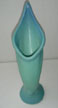
1990s
Darker highlight blue is used sparingly. Glazers during this period preferred only a hint of the darker accent, producing a subtler effect than the bold oversprays of earlier eras.
When dating Ming Blue pieces, look at the distribution of color. Early pieces have more variation top to bottom. Mid-century pieces look similar to the 1920s but differ in clay and markings. Late pieces are the most uniform. The glaze alone is not enough — always check the bottom.
3. Mulberry & Rose Family
From deep maroon to dusty pink — a complex lineage
The Mulberry and Rose family is one of the most confusing for collectors because the names changed over the decades while the colors overlapped. A piece that looks like Mulberry may actually be Persian Rose, depending on when it was made. Understanding the timeline is the key to getting the identification right.
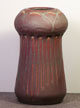
1903 Mulberry
Early Mulberry with green highlights and clay showing through the relief areas. The exposed clay adds warmth and visual texture, creating a contrast between glazed and unglazed surfaces that is characteristic of early Van Briggle.
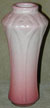
1914 Light Mulberry
A lighter treatment with heavy overspray of blue-tinted white. The combination of Mulberry base and blue-white overspray creates a soft, complex surface quite different from the darker Mulberry of earlier and later years.

1915 Mulberry
Deep and rich with a wide tonal range. This is considered one of the finest expressions of the Mulberry glaze, with color that can shift from near-black in the recesses to a warm reddish-purple on the high points.

1922 – 1926 Mulberry
The classic USA period Mulberry: dark, rich, with deep maroon overspray. Pieces from these years are among the most recognizable in the Mulberry family and are highly sought after by collectors.

Late 1920s Mulberry
With blue overspray and a lighter overall appearance. The shift toward lighter tones marks the beginning of a transition that would eventually lead to Persian Rose.

1930s – Early 1940s
The color gradually shifts toward what would become Persian Rose. Pieces from this transitional period can be difficult to classify, sitting in a gray area between the two glaze names.

Late 1940s Persian Rose
Persian Rose was introduced in 1946. Early production was as dark as Mulberry, but the color stabilized by mid-1946 into the familiar rosy hue. It was discontinued in 1968, later reintroduced, and remains in production today.

1982 – 1983 Desert Rose
A more "dusty" rose treatment. Despite the different name, many Desert Rose pieces closely resembled the older Persian Rose, making name alone an unreliable distinguishing feature.

1988 – 1989 Dusty Rose
Ranges from darker tones to nearly pinkish white, with lighter blue highlights. No longer in production. The wide range of possible shades makes Dusty Rose pieces variable in appearance even within the same short production run.

2005 Persian Rose
Persian Rose returned in 2005 with an appearance similar to the original 1946 introduction — darker and richer than the stabilized mid-century version. A deliberate return to roots.
If your pottery looks like Mulberry but has post-1946 bottom markings, it is likely Persian Rose. The early Persian Rose production was intentionally dark, and many collectors mistake it for the older glaze. Always check the bottom markings and clay color before assigning a glaze name.
4. White, Ivory & Moonglo
From early ivory experiments to Clem Hull's engineered whites
White and ivory glazes have been part of the Van Briggle palette since the earliest years, but the most important development in this family came in 1946 with the introduction of Moonglo. That formula, engineered during World War II, would become one of the pottery's most enduring glazes.
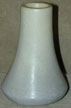
1906 Ivory
A white or ivory glaze that transitions to light violet at the bottom of the piece. The color shift from top to bottom gives these early ivories a gentle, organic feel that distinguishes them from the more uniform whites of later decades.
Teens White
Many shades and combinations. Teens-era whites often feature colorful oversprays that add complexity and visual interest. No two pieces are quite the same, and the range of effects achieved with a nominally "white" glaze is impressive.
1946 – 1960s Moonglo
A new opaque white glaze introduced in 1946. Moonglo represented a significant departure from the more translucent whites of earlier eras. It provided clean, consistent coverage that worked well on production pieces.

1979 Moonglo
Reformulated for greater opacity. The change was driven by a practical problem: the darker clay body used after 1970 was showing through the original Moonglo formula, giving the white a grayish or brownish undertone. The new formula solved this by blocking more of the clay color.

1983 – 1988 Iceberg
Moonglo with a slight blue tint. The blue collects in the crevasses and low points of the relief, accentuating the sculptural detail. Iceberg turns the pottery's signature relief work into a visual feature of the glaze itself.
1987 – 1988 Moonglo Mist
Blue overspray on the high points of the relief — the opposite approach from Iceberg, which collected blue in the low points. Moonglo Mist and Iceberg make an interesting pair: same base glaze, same blue tint, but applied to create opposite effects.

1993 Moonglo
A possible reformulation that produced a distinctly brighter white than earlier Moonglo versions. Whether this was an intentional formula change or a variation in raw materials is not entirely clear, but the visual difference is noticeable.
Historical note: Mr. McDermott engineered the Moonglo formula during World War II. Master Potter Clem Hull helped introduce it in 1946. Clem's father, Walter Austin Hull — a physicist honored for his work in cement and ceramics during World War I — also consulted on glaze development. Walter, Clem, and Clem's wife Fran all worked on the Manhattan Project before joining Van Briggle. Clem later developed the Gold Ore Glaze, adding another chapter to the Hull family's contributions to Van Briggle's glaze chemistry.
5. Gloss Glazes (Eames Era & Later)
Mid-century modernism meets Colorado Springs
During the 1950s and 1960s, Van Briggle responded to the modernist demand for glossy, colorful ceramics by acquiring Dryden Pottery designs and hiring Dryden Master Potter Joe Jezek. The result was a line of gloss-glazed pieces quite different from Van Briggle's traditional matte finishes — and a source of ongoing debate among collectors.
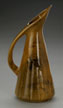
1954 – 1956 Honey Gold
Initially produced by Dryden in Kansas, then moved to Colorado in 1956. Often features a white or green drip glaze over the gold base. These early Honey Gold pieces represent the beginning of Van Briggle's Eames-era experiment.

1954 – 1956 Lake Trout Green
Same production history as Honey Gold: Dryden origin in Kansas, Colorado production from 1956. A glossy green that satisfied mid-century taste for bright, clean colors.
1980s Jet Black
Produced both with and without a white drip accent. Jet Black pieces have a dramatic presence that contrasts sharply with Van Briggle's more traditional earth-toned palette.

1980s – Present: Celadon
An ongoing gloss glaze that has remained in the Van Briggle lineup for decades. Celadon provides a soft green that bridges the gap between the pottery's traditional matte greens and its mid-century gloss experiments.
1980s – Present: Cobalt Blue
Another ongoing gloss glaze. Cobalt Blue is deeper and more intense than Ming Blue, with the reflective surface of a gloss finish rather than Ming Blue's characteristic matte texture.

1987 – 1989 Honey Gold (Revival)
A return to the Honey Gold name, often with Trout Green highlights. The late-1980s version was a conscious callback to the mid-century originals.
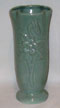
1982 – 1988 Jade
Now discontinued. Jade was very similar to Celadon, and distinguishing between the two can be difficult without production records or precise dating information.
A note on "Anna Van" pieces: The "Anna Van" name has no connection to Anne Van Briggle — it was chosen casually. Dryden produced pieces marked "Van Briggle – Colo Spgs" while still operating in Kansas (1954–1956). Despite collector disdain for the Eames-era line, it likely achieved the strongest sales of any Van Briggle product line, providing the cash flow that kept the pottery operating through a difficult period.
6. Modern & Short-Lived Glazes
Late 20th century experiments and returns to tradition
From the 1980s onward, Van Briggle introduced several new glazes, some short-lived and others that became permanent additions to the catalog. The best of these new glazes managed to honor the pottery's Art Nouveau roots while offering something genuinely new.

1983 Midnight
A deep, dark glaze from the early 1980s. Midnight's production run was brief, making examples relatively uncommon.
1988 Goldenrod
An attempt to return to the pottery's roots with a warm, golden tone. Goldenrod served as a predecessor to Aspen Sunrise, which would refine and improve upon the same impulse.

1999 – Present: Lilac Blue
One of the more successful modern introductions. Lilac Blue passed focus-group testing before entering production, reflecting a more market-conscious approach to glaze development than Van Briggle had traditionally employed.
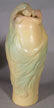
2001 – Present: Aspen Sunrise
Of all the post-Artus glazes, Aspen Sunrise is the one that would have pleased Artus more than any other. Its warm, luminous quality captures something of the organic dynamism that defined the earliest Van Briggle glazes, translated into a modern production context.
2000 – Present: Plum
A modern revival of the Plum name, connecting back to the 1915 original. The contemporary Plum adds another purple-toned option to the Van Briggle palette.
2004 – Present: Vintage Green
A deliberate reference to the earliest Van Briggle greens. Vintage Green acknowledges the pottery's history while providing a glaze that works with contemporary production methods and clay bodies.
7. Browns & Earth Tones
The working end of the palette, from 1900s browns to 1980s Russet
Browns are the most under-documented corner of the Van Briggle palette, and the one that turns up most often in identification emails. They rarely made the catalog covers, so a plain brown piece is easy to mistake for an unmarked oddity or a piece by another maker. In fact browns run through the pottery's entire history, from the earliest experimental years to the last decades of commercial production.
If your piece is a single solid brown on a sandy buff clay body, the sections below are where to start. The date ranges narrow things considerably, because most of these glazes had short production runs.
1900s – 1920s: The Early Browns
An early Van Briggle list of brown glazes names Light Brown, Medium Brown, Dark Brown, Golden Brown, and Claret Brown. In practice the early pottery used many more shades than that, ranging from near-butterscotch through very dark chocolate, and often combined brown with yellow touches or a green overspray. Early browns appear on dated pieces across roughly 1905 to 1920.
Pictured is the 1907 Gold-Brown, covered in Early Glazes.
1920s – 1935: Mountain Crag Brown
First advertised as “the browns and greens found in a mountain crag,” and better described as a honey brown with a green overspray. Produced through the 1920s until the flood of 1935, when the formula was lost. A potter who remembered the recipe mixed a single batch in the 1950s and was told by the owner not to make another.
Two things to know before you go searching. The name was at some point recorded in error as “Mt. Craig,” and stayed that way until the early 1920s literature turned up showing it began as Mountain Crag Brown. Both spellings still circulate in listings, so search each.
The dating is not fully settled either. The trade literature that establishes the name points to a 1920s introduction, but pieces carrying this brown-with-green- overspray treatment are commonly labelled to the teens, including examples in our own archive. The likeliest explanation is that the treatment was in use before it was named and advertised. Treat a “teens Mountain Crag” attribution as plausible rather than precise.
1956: Gold Ore
Produced for only a few months in 1956, which makes it genuinely scarce. Powdered gold ore from the Cripple Creek mines was worked in to give a speckled effect, with pieces dipped in a gold-bearing solution before glazing. The clay showing at the bottom is the beige, smooth body used for the Anna Van Briggle pieces of the 1955 to 1968 period.
Gold Ore pieces carry their own bottom marks, which is unusual. Some read “Gold Ore Glaze Made in Colo Spgs.” with or without the addition of “Van Briggle”; others carry a “G” inside an “O” alongside “by Van Briggle Colo. Spgs.” These pieces frequently sell unidentified, since the glaze is not widely recognized.
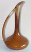
Late 1960s – 1978: Brown & Dark Brown Gloss
Van Briggle brochures from the 1960s refer to a brown glaze called Honey Gold. By Jeff Stevenson's account that glaze appears to have been modified in the late 1960s into the brown and dark brown gloss glazes that were in production when he joined the pottery in 1969. These were sometimes marketed as “Volcanic Ash” glazes, largely a marketing term, though the recipes did include bentonite, a clay formed from decomposed volcanic ash.
Both were discontinued around 1978 because of persistent crazing problems. If you have a gloss brown piece with a fine crackle across the surface, this era is the likely explanation, and the crazing is a manufacturing fault rather than damage.
Pictured is a Honey Gold ewer with the white drip at the neck, the ancestor of this line rather than the line itself.
1978 – 1984: Russet (First and Second Versions)
The matte earth-tone brown most likely to turn up on a late piece. Russet was the first glaze developed by Jeff Stevenson, son of the Stevenson family who owned the pottery from 1969 until it closed, after his father asked him for an earth-tone matte. It was introduced in 1978.
There are two versions. A glazer accidentally poured some Midnight glaze into the Russet vat, and the darker accidental result was judged better than the original, so the recipe was modified to reproduce the mistake. That second version ran until Russet was discontinued in 1984. The practical consequence for collectors is that a noticeably darker Russet is the later of the two.
Late 1970s: Sunset Gloss
Another Stevenson glaze, in use for only a short period, which makes it rare and elusive. Sunset turns up on hand-decorated pieces, including work by the etcher Marge Pope (MLP).
1980s: Craze-Resistant Gloss Brown
After the earlier gloss browns were withdrawn over crazing, Stevenson developed a replacement gloss brown that resisted crazing, most likely around 1984, and it stayed in production for several years. A clean, uncrazed gloss brown on buff clay is more likely to be this later glaze than a survivor from the 1970s.
A note on plain browns. Not every brown piece carries a catalog glaze name. Van Briggle produced a good deal of plainer ware in single solid colors, particularly on simple utility shapes such as pitchers and mugs, and the production records for those are thin. If a piece does not match any of the glazes above, the honest answer is often that it is an unnamed production brown rather than an unrecognized rarity. Be cautious of any listing that assigns a specific glaze name without evidence.
Sources for this section: Jeff Stevenson's own account of his glaze development work at Van Briggle from 1969 to 1988, and the brown glaze documentation compiled at Van Briggle Notes, which reproduces his recollections along with photographed examples.
Further Resources
Glaze identification is most effective when combined with other dating methods. These companion guides cover the marks, clays, and timeline information that complete the picture.
- Markings & Identification — How to read and date Van Briggle bottom markings, with museum-quality reference photos.
- Dating Guide — A comprehensive timeline for placing your piece in the right era.
- Clay Body History — How the clay itself changed over the decades, and why it matters for identification.
- Artist & Maker Mark Directory — Individual potter and finisher marks found on Van Briggle pieces.